1
qooxdoo Documentation, Release 1.5.1
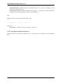
• _showChildControl(id): Executes show() on the child control. This method also creates the control if
that hasn’t happened yet. It also returns the control so other properties can be applied to it.
• _excludeChildControl(id): Excludes the widget using exclude(). When the control is not yet
created the function does nothing. The method has no return value.
• _isChildControlVisible(id): Returns true if the child control with the given ID is created and
visible.
• hasChildControl(id): Returns true if the child control with the given ID has been created.
Styling
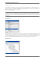
Child controls are automatically supported by the appearance system. For every child control a selector is generated
which starts with the first widget which is not a child control itself. Typical selectors look like:
• spinner/up-button
• groupbox/legend
• tree-item/icon
As a container for child controls may be a child control for another container as well, even more complex selectors are
possible:
• list/scrollbar-x/slider
• splitbutton/button/icon
This means that even the deepest child control can be easily accessed by theme authors. Widget authors should
define the styling of a widget in the appearance theme and not in the widget itself. The widget and the
_createChildControlImpl method should only apply functional properties like zIndex or tabIndex, but
no decorations, colors or fonts for example.
As mentioned, a key always starts with the appearance of the first widget which is not itself a child control. Appearance
values of the inner widgets are ignored as long as they are used as a child control. Instead, the ID of the child control
is used. The / is used to separate the child controls. All widgets added through user code start with their own
appearance. For example, the items of the List widget have the appearance list-item. Their appearance key is
also list-item and not list/item.
For details about styling please refer to the theming article.
HTML Elements
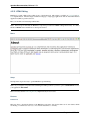
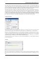
A normal qooxdoo widget consists of at least two HTML Elements (API). The first one is the container element which
is the outer frame of each widget. The inner one is the content element which is the target for children added to the
widget. The content element is also used for the iframe element of the Iframe widget and the image element of the
Image widget. This means it may contain children or may be used by a native DOM element which does not allow
any children.
There might be some other elements depending on the configuration:
• shadow: Placed into the container with negative offsets to be visible behind the original widget.
• decorator: Placed into the container with the same size as the container. Used to render all kinds of decorators.
• protector: Helper to fix certain hover issues when changing decorators during event sequences, e.g. hover
effects.
134
Chapter 4. GUI Toolkit